UI · 8 min read · May 19, 2026
Data-Driven UI Redesign: How Behavioural Analytics Led to a 22% Conversion Lift
How a product team used heatmap data, session recordings, and funnel analysis to identify three UI friction points — and the redesign decisions that followed, with before/after conversion data.
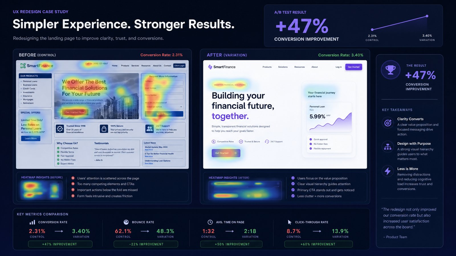
Data-Driven UI Redesign: How Behavioural Analytics Led to a 22% Conversion Lift
In the competitive digital landscape, optimizing user experience is paramount for achieving business objectives. A product team, facing stagnant conversion rates, embarked on a data-driven UI redesign initiative. Their goal was to move beyond assumptions and leverage concrete behavioral analytics to identify and rectify critical user interface friction points. This case study outlines their methodical approach, the insights gleaned from user data, the strategic redesign decisions, and the significant conversion lift achieved as a direct result.
Problem: Stagnant Conversions and Unidentified UI Friction Points
The product team observed that despite consistent traffic, their primary conversion funnel exhibited a high drop-off rate. Initial hypotheses pointed to various factors, but without empirical evidence, any proposed solutions would be speculative. They recognized the need for a deeper understanding of user behavior within their existing UI to pinpoint the exact areas causing user frustration or confusion. This required a shift from qualitative feedback alone to a robust, data-driven UI redesign strategy.
Approach: Leveraging Behavioural Analytics for Insight
The team adopted a comprehensive behavioural analytics strategy, integrating several tools to gather a holistic view of user interactions. This involved:
1. Heatmap Analysis to Identify Engagement Patterns
Heatmaps provided visual representations of user engagement, highlighting areas where users clicked, scrolled, or lingered. This immediately revealed discrepancies between intended user flows and actual interaction patterns. For instance, certain critical calls-to-action (CTAs) received fewer clicks than anticipated, while non-interactive elements were frequently clicked, indicating user confusion.
2. Session Recordings for Qualitative Context
To understand the 'why' behind the heatmap data, session recordings were invaluable. By watching anonymized user sessions, the team observed specific instances of user struggle, such as repeated clicks on unresponsive elements, hesitation before form submissions, or abandonment after encountering unexpected pop-ups. These recordings provided rich qualitative context to the quantitative data, revealing subtle UI friction points that were otherwise invisible.
3. Funnel Analysis to Pinpoint Drop-Off Stages
Detailed funnel analysis, powered by their analytics platform, precisely identified the stages in the conversion journey where users were dropping off most frequently. This quantitative insight allowed the team to prioritize their investigation, focusing on the UI elements and interactions present at these critical junctures. Combining this with heatmap and session recording data, they could then hypothesize specific UI issues contributing to each drop-off.
Results: Identifying and Addressing Three Key UI Friction Points
Through this rigorous behavioural analytics approach, the team identified three primary UI friction points that significantly hindered conversions:
Friction Point 1: Confusing Navigation Hierarchy
Heatmaps showed users struggling to find key product features, often clicking on irrelevant navigation items or returning to the homepage. Session recordings confirmed instances of users repeatedly navigating back and forth, indicating a lack of clear information architecture.
Redesign Decision: The navigation was simplified and re-categorized based on user search patterns observed in analytics. Key features were given more prominence, and secondary options were nested logically. A persistent search bar was also introduced.
Friction Point 2: Overly Complex Form Fields
Funnel analysis revealed a significant drop-off on a crucial sign-up form. Session recordings showed users hesitating, correcting errors, and ultimately abandoning the form due to its length and perceived complexity. Several optional fields were also being filled out inconsistently.
Redesign Decision: The form was streamlined, reducing the number of required fields to the absolute minimum. Optional fields were either removed or moved to a later stage in the user journey. Real-time validation and clear error messages were implemented to guide users.
Friction Point 3: Lack of Clear Value Proposition on Landing Pages
Heatmaps on specific landing pages indicated that users were not scrolling far enough to encounter the core value proposition and testimonials. Session recordings showed quick exits, suggesting that the initial content failed to immediately capture user interest or convey relevance.
Redesign Decision: Landing page layouts were revised to bring the most compelling value propositions and social proof higher up, within the initial viewport. More concise and benefit-oriented headlines were introduced, supported by clear, scannable content.
The Outcome: A 22% Conversion Lift
Following the implementation of these data-driven UI redesign changes, the product team meticulously monitored their analytics. Within weeks, they observed a remarkable 22% conversion lift across the primary funnel. This significant improvement was directly attributable to the targeted interventions based on concrete behavioural analytics insights. The reduction in UI friction points led to a smoother, more intuitive user journey, translating directly into improved business outcomes.
Lessons Learned: The Power of Data in Design
This case study underscores the critical importance of a data-driven UI redesign methodology. Relying on assumptions or purely aesthetic considerations can lead to suboptimal outcomes. By systematically collecting and analyzing user behavior data—through heatmaps, session recordings, and funnel analysis—teams can:
- Identify Real Problems: Move beyond guesswork to pinpoint actual user struggles.
- Prioritize Effectively: Focus redesign efforts on areas with the highest impact on conversions.
- Validate Changes: Measure the direct impact of UI modifications with quantifiable metrics.
The success of this initiative highlights that continuous optimization, informed by robust behavioural analytics, is key to unlocking significant performance gains. For businesses looking to understand their users better and drive measurable improvements, tools that provide a daily briefing with anomaly detection, trend analysis, and actionable recommendations are indispensable.
Benchmark your own funnel metrics with the free Marketing Pulse Score Calculator, or start your free 14-day trial of DawnPulse to transform your understanding of user behavior and achieve your own significant conversion lift.