UX · 8 min read · May 19, 2026
7 UX Metrics That Predict Conversion Rate — And How to Track Them Without a UX Team
Time-on-page, scroll depth, rage clicks, and four more UX signals that directly correlate with conversion rate — with practical tracking setups for teams without dedicated UX resources.
7 UX Metrics That Predict Conversion Rate — And How to Track Them Without a UX Team
In the competitive digital landscape, understanding user behavior is paramount to driving business growth. While many organizations invest heavily in dedicated User Experience (UX) teams, it is entirely possible for lean teams to identify and track critical UX metrics that directly correlate with conversion rate. This article will delve into seven such metrics, offering practical strategies for their implementation and analysis, even without extensive UX resources. By focusing on these key indicators, businesses can gain actionable insights into user engagement and optimize their digital products for improved performance.
The Indispensable Link Between UX and Conversion
Conversion rate optimization (CRO) is often viewed through the lens of A/B testing and marketing funnel adjustments. However, the underlying user experience profoundly influences a user's journey from initial interaction to desired action. A seamless, intuitive, and engaging UX reduces friction, builds trust, and guides users efficiently towards conversion. Conversely, a poor UX can lead to frustration, abandonment, and ultimately, lost revenue. Identifying and monitoring specific UX metrics provides a data-driven approach to understanding where and why users succeed or struggle, enabling targeted improvements that directly impact the bottom line.
Key UX Metrics That Predict Conversion Rate
1. Time on Page/Session Duration
What it is: Time on page measures the amount of time a user spends actively viewing a specific page. Session duration tracks the total time a user spends on your website or application during a single visit. While seemingly simple, these metrics offer profound insights into user engagement and content relevance. A longer time on page or session duration often indicates that users are finding value in your content or product, suggesting a higher likelihood of progressing towards a conversion.
Why it predicts conversion: When users spend more time interacting with your content, they are more likely to absorb information, understand your value proposition, and engage with calls to action. For e-commerce, extended browsing time on product pages can signal strong purchase intent. For SaaS platforms, longer session durations often correlate with deeper feature exploration and increased product adoption, both precursors to subscription or upgrade conversions.
How to track without a UX team: Most analytics platforms (e.g., Google Analytics 4 (GA4)) automatically track time on page and session duration. Focus on segmenting these metrics by traffic source, user type, and specific page types (e.g., landing pages, product pages, blog posts). Look for pages with unusually low times, which might indicate confusing content or navigation issues. Conversely, high times on key conversion pages are positive signals.
2. Scroll Depth
What it is: Scroll depth measures how far down a user scrolls on a given page. This metric moves beyond simple page views, providing a more nuanced understanding of content consumption. It reveals whether users are engaging with the entire content of a page or only skimming the top section.
Why it predicts conversion: For content-heavy pages, such as detailed product descriptions, long-form articles, or sales pages, high scroll depth indicates that users are actively consuming the information necessary to make an informed decision. If critical information or calls to action are placed lower on the page, high scroll depth is essential for their discovery and interaction, directly impacting conversion rates.
How to track without a UX team: Many analytics tools offer scroll depth tracking as a built-in feature or through simple tag manager implementations. Tools like Google Tag Manager can be configured to fire events at various scroll thresholds (e.g., 25%, 50%, 75%, 100%). Analyze scroll depth in conjunction with time on page to understand if users are just scrolling quickly or genuinely reading. Low scroll depth on important pages suggests that key information might be missed, requiring content reordering or more prominent placement of CTAs.
3. Rage Clicks and Dead Clicks
What they are: Rage clicks occur when a user rapidly clicks multiple times in the same area, often indicating frustration or confusion because an element is unresponsive or not behaving as expected. Dead clicks are clicks on non-interactive elements, suggesting users perceive them as clickable or are looking for functionality that isn't present.
Why they predict conversion: Both rage clicks and dead clicks are strong indicators of user frustration and a broken user experience. Frustrated users are highly unlikely to convert; they are more prone to abandon the site or application. Identifying and resolving the underlying causes of these clicks can significantly reduce friction in the user journey, leading to smoother interactions and improved conversion rates.
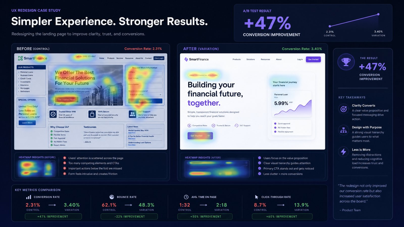
How to track without a UX team: While advanced UX analytics tools specialize in this, many general analytics platforms can be configured to track these. For rage clicks, look for multiple clicks within a short timeframe on a small area. For dead clicks, track clicks on elements that are not links or buttons. Heatmap and session recording tools (some with free tiers or trials) are invaluable here, visually highlighting areas of user struggle. Regular review of these recordings can quickly pinpoint problematic UI elements or confusing layouts.
4. Form Abandonment Rate
What it is: Form abandonment rate measures the percentage of users who start filling out a form but do not complete it. This is a direct indicator of friction within a critical conversion step, such as sign-up forms, checkout processes, or lead generation forms.
Why it predicts conversion: Forms are often the final gateway to conversion. A high abandonment rate signifies significant barriers, which could include excessive fields, unclear instructions, unexpected errors, or privacy concerns. Optimizing forms based on this metric can dramatically improve the completion rate and, consequently, the overall conversion rate.
How to track without a UX team: Most analytics platforms can track form submissions and starts. By setting up event tracking for form interactions (e.g., form_start, field_focus, form_submit), you can calculate the abandonment rate. Further, analyze which specific fields users are abandoning. This can be done by tracking field-level interactions and identifying the last field completed before abandonment. This data points directly to areas needing simplification or clearer guidance.
5. Task Completion Rate
What it is: Task completion rate measures the percentage of users who successfully complete a predefined task or goal within your website or application. This could be anything from finding specific information, adding an item to a cart, or completing a purchase.
Why it predicts conversion: This metric directly assesses the effectiveness of your design in enabling users to achieve their objectives. If users cannot complete key tasks, they cannot convert. A high task completion rate indicates an efficient and user-friendly path to conversion, while a low rate signals significant usability issues that need immediate attention.
How to track without a UX team: Define clear tasks or user flows within your analytics platform. Use event tracking to mark the beginning and end of a task. For example, track clicks on a product category, then clicks on a specific product, then adding to cart, and finally checkout completion. A low completion rate for a critical task indicates a need to simplify the user journey or improve the clarity of instructions.
6. Error Rate
What it is: Error rate measures the frequency with which users encounter errors or obstacles while interacting with your website or application. This includes technical errors (e.g., 404 pages, server errors) and user-generated errors (e.g., incorrect form submissions, failed searches).
Why it predicts conversion: Errors are significant conversion killers. Each error encountered creates friction, erodes trust, and can lead to user abandonment. A high error rate directly correlates with a poor user experience and a reduced likelihood of conversion. Proactively identifying and resolving common errors is crucial for maintaining a smooth and efficient user journey.
How to track without a UX team: Web server logs and analytics platforms are excellent sources for tracking technical errors like 404s and server errors. For user-generated errors, implement event tracking for specific error messages (e.g., "Invalid email format," "Password too short"). Monitor these events closely and prioritize fixing the most frequently occurring errors. Tools that offer real-time error reporting can be particularly valuable here, providing immediate insights into user pain points.
7. Net Promoter Score (NPS) or Customer Satisfaction (CSAT)
What they are: While not strictly a behavioral UX metric, NPS and CSAT are powerful indicators of overall user sentiment and satisfaction, which indirectly predict conversion and retention. NPS measures customer loyalty by asking users how likely they are to recommend your product or service. CSAT measures satisfaction with a specific interaction or aspect of your product.
Why they predict conversion: Satisfied and loyal users are more likely to convert, make repeat purchases, and advocate for your brand. A high NPS or CSAT score suggests that your product is meeting user needs and providing a positive experience, which fosters trust and encourages continued engagement. Conversely, low scores signal underlying UX issues that could be hindering conversion.
How to track without a UX team: Simple in-app surveys or email surveys can be used to collect NPS and CSAT data. Many survey tools offer free or affordable plans. Keep surveys short and focused to maximize response rates. While these metrics provide qualitative insights, they can be correlated with behavioral data to understand how satisfaction impacts conversion paths. For instance, segment users by their NPS score and analyze their conversion rates to see the direct impact of sentiment.
Implementing a Data-Driven Approach Without a Dedicated UX Team
Successfully tracking and acting on these UX metrics doesn't require a large, specialized UX team. It requires a commitment to a data-driven approach and leveraging the tools and resources already available or easily accessible. Here's how:
- Leverage existing analytics platforms: Most businesses already use tools like GA4, which can be configured to track many of these metrics with minimal technical effort.
- Utilize tag managers: Tools like Google Tag Manager empower non-developers to implement event tracking for scroll depth, form interactions, and error messages without modifying website code.
- Explore heatmap and session recording tools: Many affordable or free options exist that provide visual insights into user behavior, highlighting areas of frustration (rage clicks, dead clicks) and engagement.
- Prioritize and iterate: Don't try to fix everything at once. Focus on the metrics that show the most significant friction or the greatest potential for conversion improvement. Implement small changes, measure their impact, and iterate.
- Cross-functional collaboration: Encourage collaboration between marketing, product, and development teams. Each team brings a unique perspective that can help interpret data and devise effective solutions.
By systematically monitoring these seven UX metrics, even teams without dedicated UX resources can gain a profound understanding of user behavior, identify critical areas for improvement, and ultimately drive higher conversion rates. The insights gained will not only optimize your digital products but also foster a more user-centric culture within your organization.
Ready to Transform Your Data into Actionable Insights?
Understanding these UX metrics is the first step. The next is to efficiently collect, analyze, and act on this data. DawnPulse empowers businesses to do just that — with one-click connections for Shopify, Mailchimp, and HubSpot, plus CSV/Excel upload for any other tool, it provides an AI-powered daily briefing with anomaly detection, trend analysis, and actionable recommendations. Stop guessing and start optimizing with data-driven confidence. Want a quick baseline first? The free Marketing Pulse Score Calculator scores your overall marketing health from 0–100 in minutes — then try DawnPulse and unlock the full conversion potential of your digital products.